
Overview
A tag is a caption added to an element for better clarity and user convenience.
- Figma library
-
Ready - Responsive
-
Ready - RH Elements
-
Ready - webRH
-
Ready
Sample element
Filled
Unfilled
Demo
View a live version of this element and see how it can be customized.
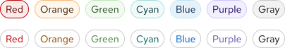
<rh-tag color="red">Red <span class="visually-hidden">Hat</span></rh-tag>
<rh-tag color="orange">Orange</rh-tag>
<rh-tag color="green">Green</rh-tag>
<rh-tag color="cyan">Cyan</rh-tag>
<rh-tag color="blue">Blue</rh-tag>
<rh-tag color="purple">Purple</rh-tag>
<rh-tag>Gray</rh-tag>

<script type="module">
  import '@rhds/elements/rh-tag/rh-tag.js';
</script>
<rh-tag> demo in a new tabWhen to use
- When you want to highlight an element on a page to draw attention to it or make it more searchable
- When you need to tag items of the same category
- When you need to indicate status
Status checklist
| Property | Status | Meaning |
|---|---|---|
| Figma library |
|
Component is available in the Figma library |
| Responsive |
|
Component responds to changing viewport sizes in Figma and the browser |
| RH Elements |
|
Component is available as a web component |
| webRH |
|
Component is available as a web component |
Related elements or patterns
Feedback
To give feedback about anything on this page, contact us.
Red Hat legal and privacy links
- About Red Hat
- Jobs
- Events
- Locations
- Contact Red Hat
- Red Hat Blog
- Diversity, equity, and inclusion
- Cool Stuff Store
- Red Hat Summit
Red Hat legal and privacy links

